Transforming the alphabet into an engaging learning experience through play, storytelling, and design.
Children often learn the alphabet through repetition and memorisation. The challenge was to create an experience that encouraged curiosity, discovery, and playful interaction while introducing typography in an accessible way.
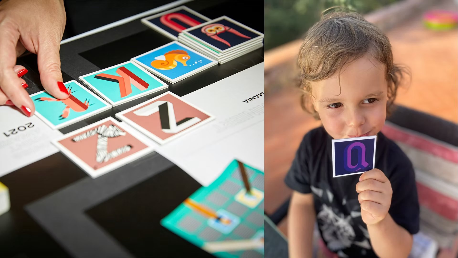
ABC Mania explores a different approach. The project combines typography, illustration, and game mechanics to transform learning into an experience driven by curiosity, exploration, and discovery.
Rather than simply teaching letters, the goal was to create meaningful associations between language, animals, and visual communication.
The Challenge
How might we make learning the alphabet more engaging while introducing children to typography in a playful and memorable way?
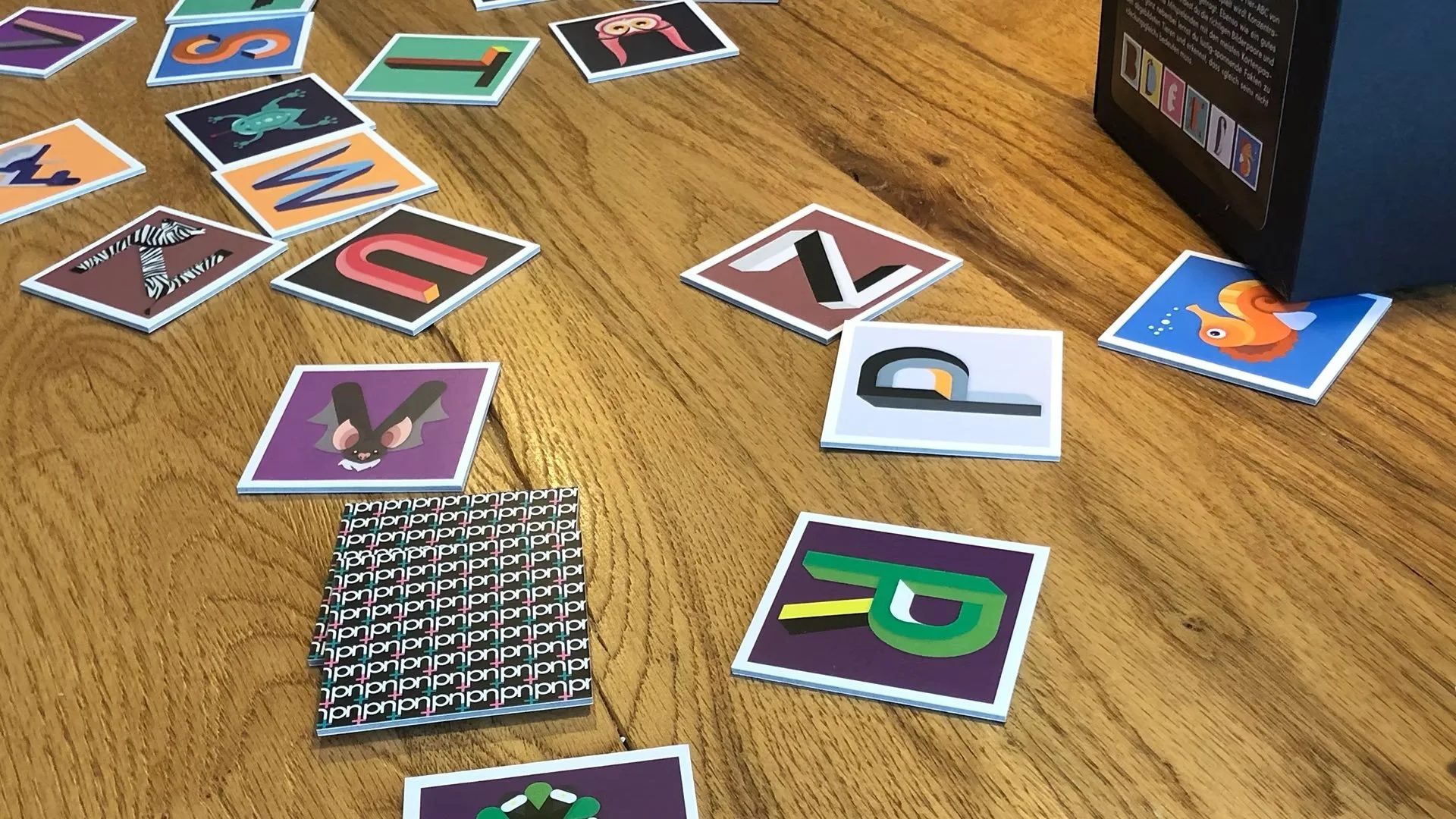
Traditional memory games rely on matching identical cards. I wanted to rethink this mechanic by encouraging children to actively connect letterforms with animals, creating stronger cognitive associations through play.
At the same time, the visual language needed to be educational, expressive, and accessible for young audiences.
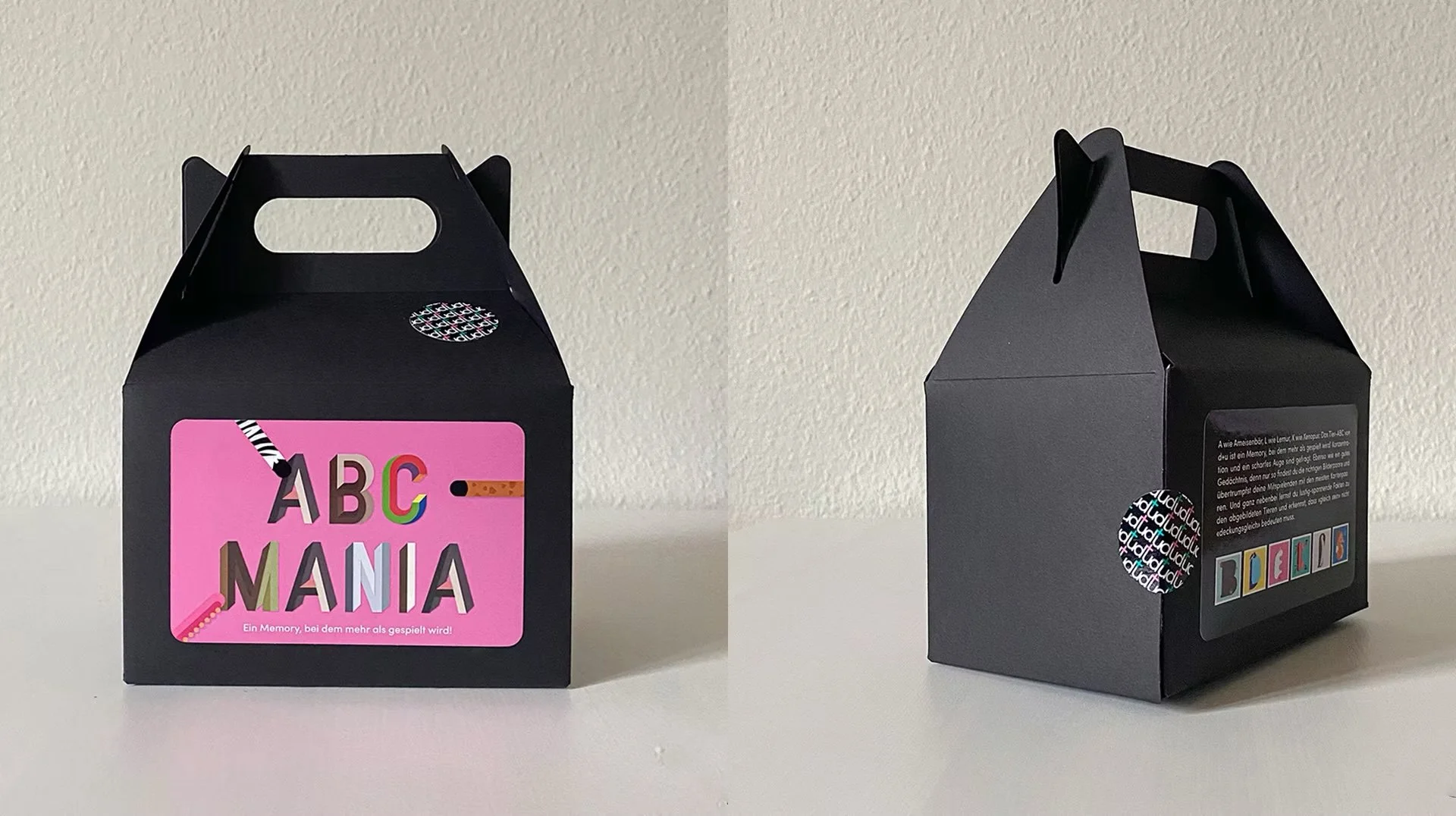
Design Approach
The concept combines three complementary elements:
Typography as the central visual language.
Animals that naturally connect to each letter of the alphabet.
Gameplay that encourages observation, memory, and exploration.
Instead of matching two identical images, players pair expressive 3D letters with their corresponding animals. Every successful match reinforces letter recognition while encouraging curiosity about the natural world.
To extend the learning experience beyond the game itself, each animal is accompanied by interesting facts, transforming every match into a small moment of discovery.
Design Process
The project began with designing an original alphabet where each letter became a three-dimensional character with its own visual personality.
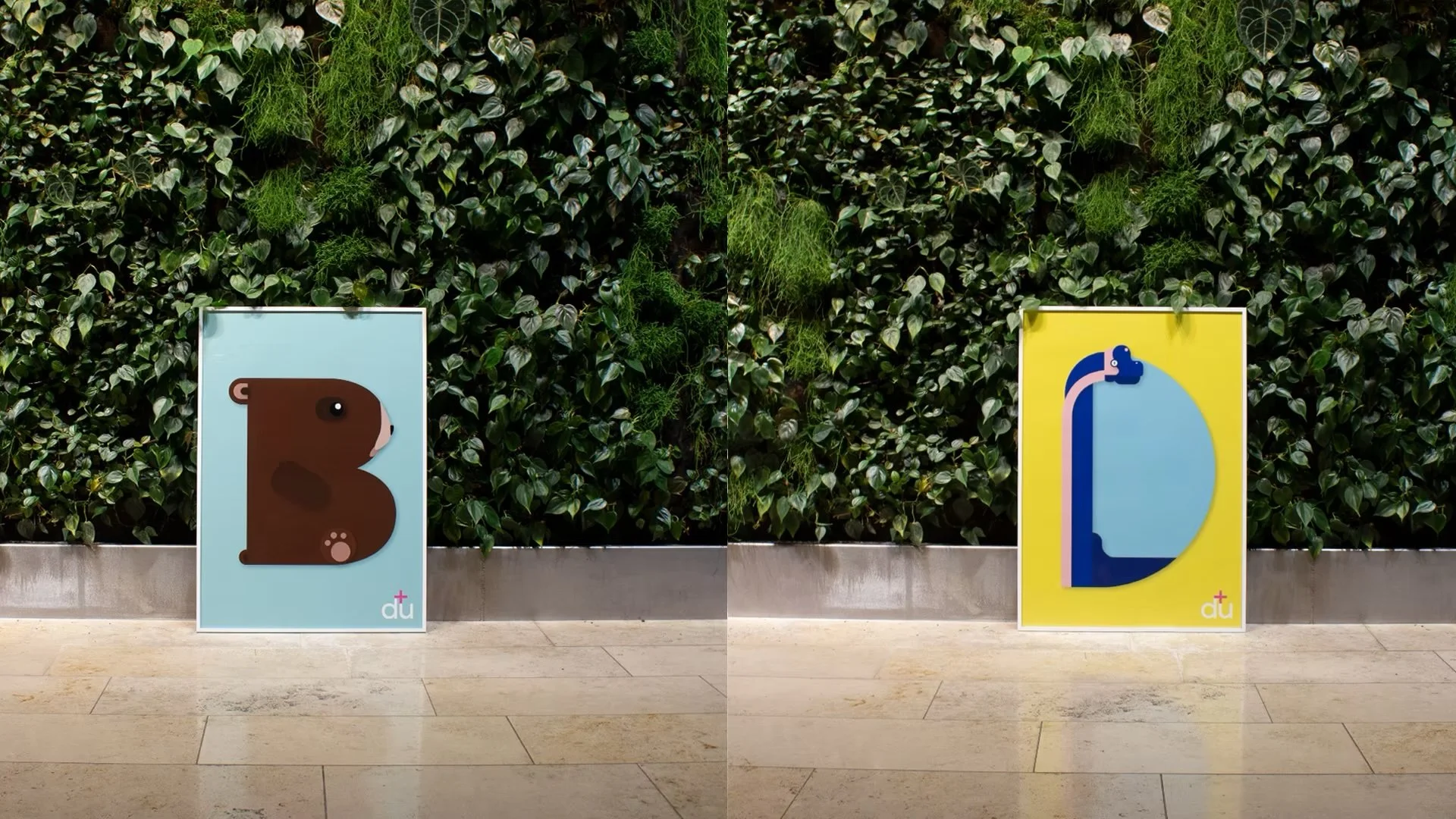
From there, the game mechanics were developed to balance education and entertainment. The objective was not simply to test memory, but to create meaningful connections between letters, words, and images.
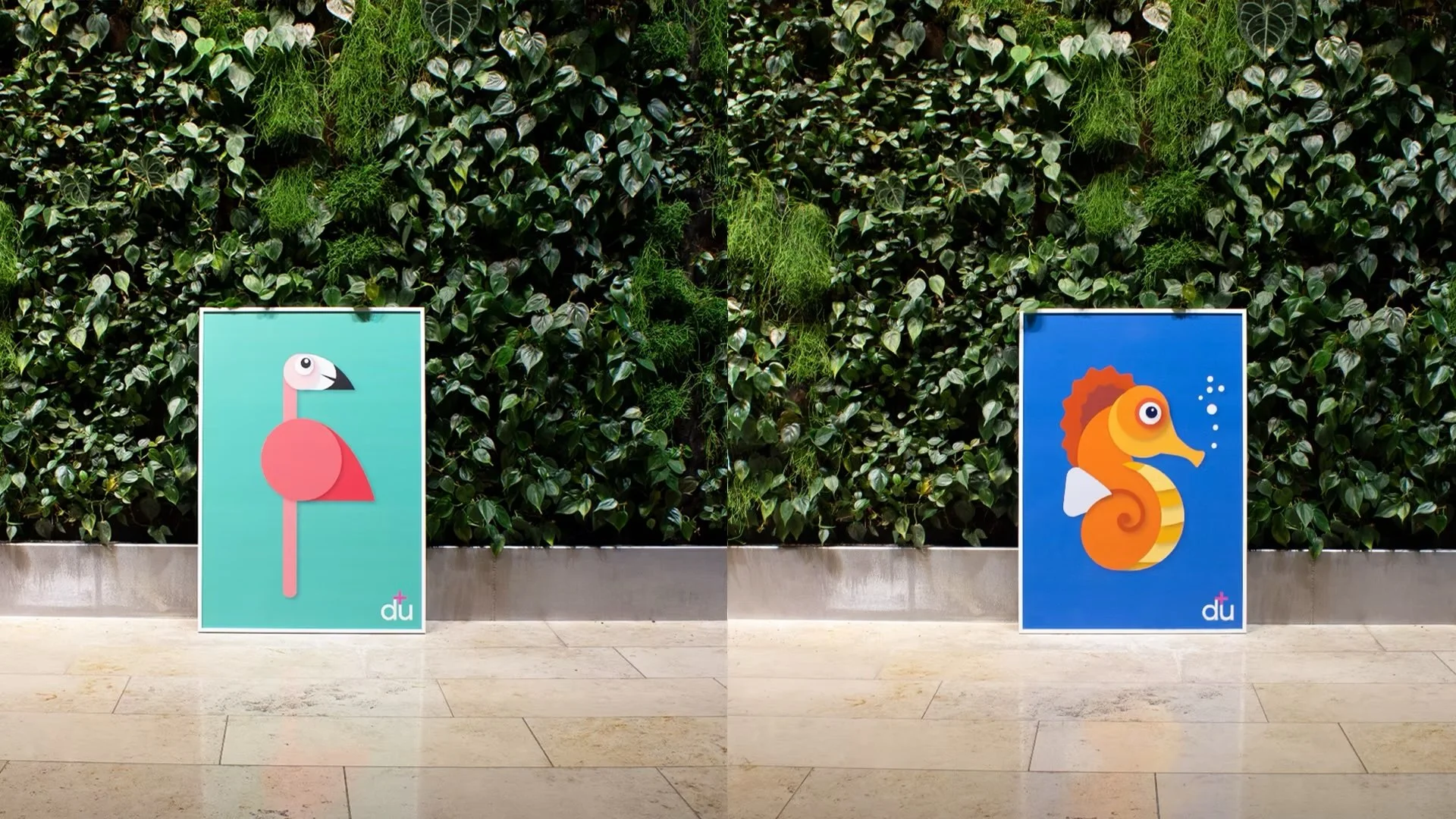
The visual identity was intentionally playful, using bold colours, tactile typography, and expressive illustrations to make learning approachable and enjoyable.
Outcome
ABC Mania demonstrates how thoughtful interaction design can make learning both educational and enjoyable.
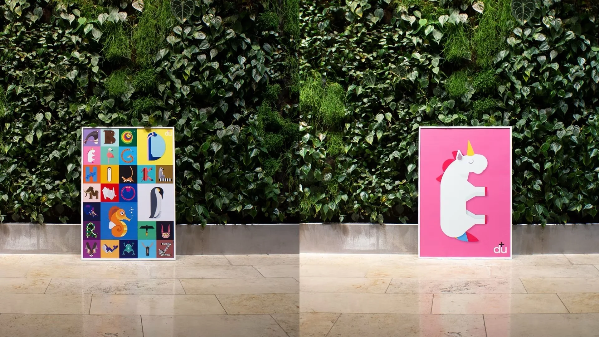
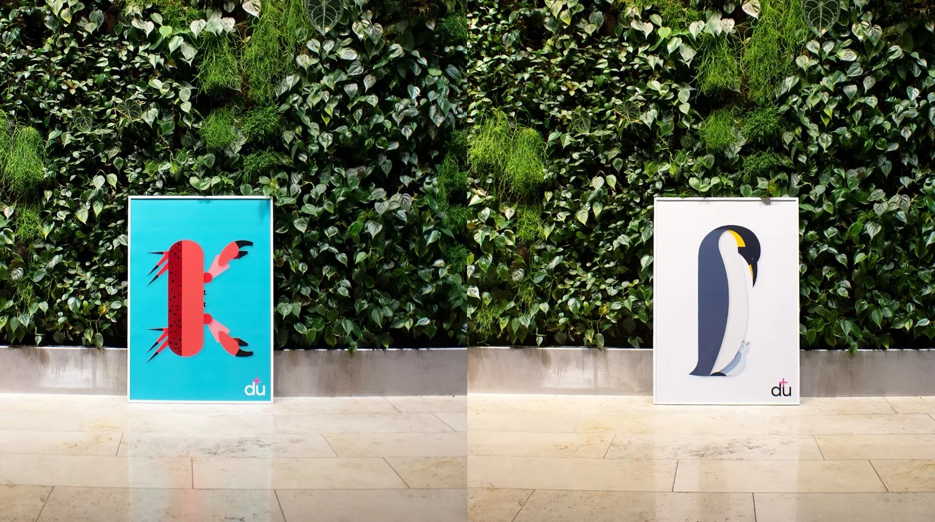
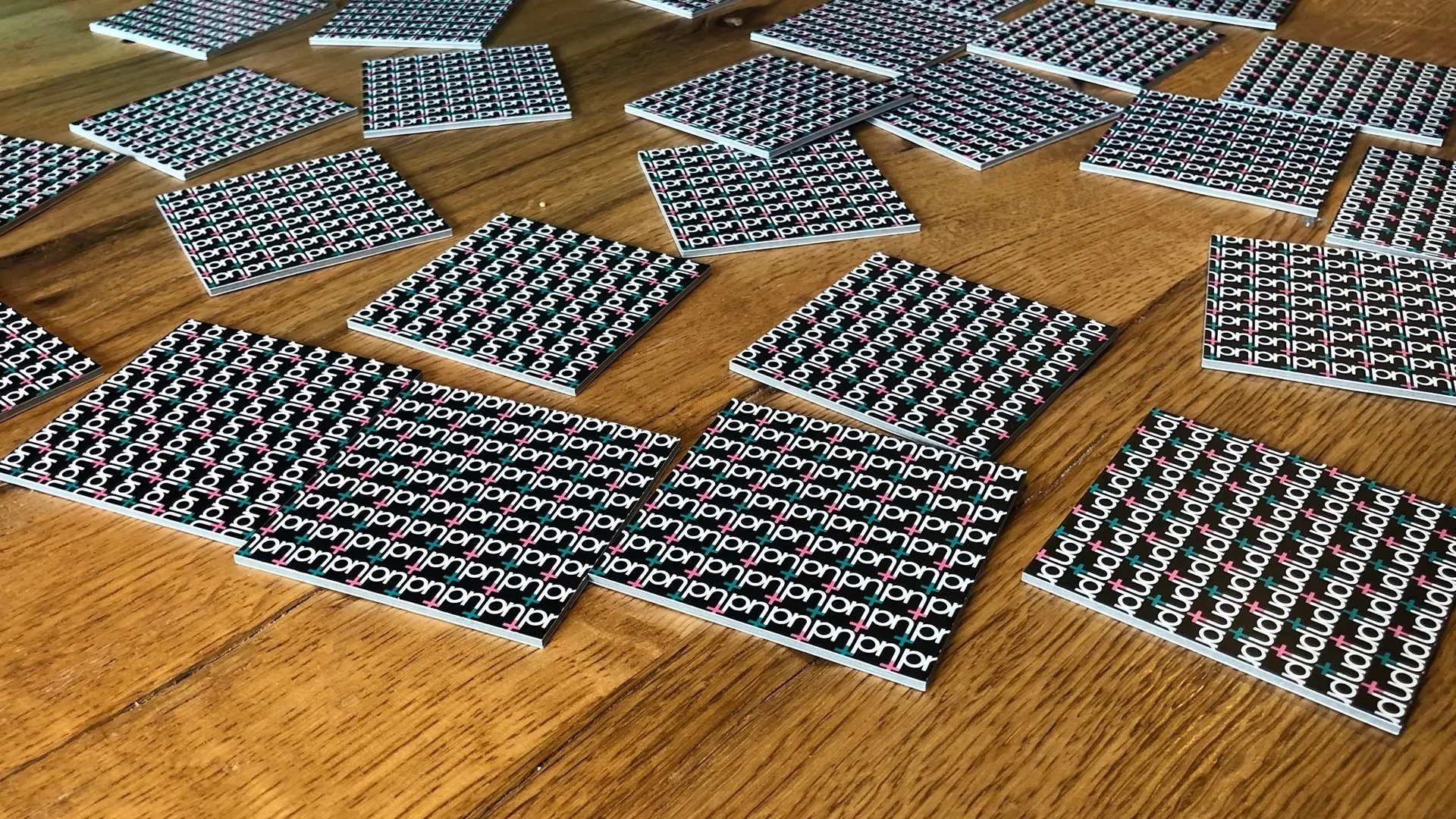
What began as a memory game evolved into a broader educational concept. The distinctive typography and illustrations were later expanded into a series of postcards and posters, extending the project beyond the board game itself.
The project received the Silver Swiss Print Award 2021 in the Printed Objects category, recognising both the concept and the quality of its execution.
Reflection
ABC Mania reinforced an important design principle that has influenced my work ever since:
People learn more effectively when they are curious, emotionally engaged, and actively involved in the experience.
Whether designing educational products or digital platforms, I strive to create experiences that encourage exploration rather than passive consumption.